Anyone who was using Crickles last year may recall that we had a couple of special bonuses pages available in January. One of them is now back for this new year too – it’s the 2023 Top 10 page and reminds you of your hardest rides in 2023 as measured by CSS. There’s a drop-down to select from your top 10 and for each one you get a map of the ride. A unique and especially useful feature is that if you were recording your heart rate on your ride you can see any sections where you were above your sustainable heart rate.
Here’s an example:
While the overall route is shown in grey, the sections in which the heart rate exceeded the rider’s sustainable level are highlighted in red.
It’s possible to zoom in and out of the map using the +/- button at the top left of the map.
This feature is only available to users who have completed the short Crickles heart health survey at . The page will be present throughout January.
For cyclists using a heart rate monitor and a power meter the Effort Spots page enables you to visualise how much time you spent at different heart rate and power levels on a given ride. This has now been enhanced to show you the exact heart rate and power level where you spent most time on the ride – the hottest spot. This is marked with a small green cross (+) and will typically lie within a hot red region:
You can hover over the cross and it will give you the numerical values for the heart rate and power at the hottest spot – in this case 152 bpm and 228W:
Adding a Reference activity works in the same way as before and now also shows you the hottest spot of that activity as a blue cross:
Again, hovering over the blue cross will show you the numerical heart rate and power values for the reference activity’s hottest spot.
Sometimes the heart rate and power combination where you actually spent the most time on a ride correspond to times when you were freewheeling and the power was zero. Since these points are not especially interesting they are not marked as hottest spots and the highest heart rate / power combination with a positive power value is selected instead. In those cases you may notice that the contours and colour coding indicate values on the y-axis that may exceed the “heat” of the hottest spot.
Garmin sports watches now provide a power figure for running, measured in watts. Garmin note that athletes who both run and cycle will find that the power numbers reported for runs are typically significantly higher than those for bike rides. To avoid running power figures distorting the power curve on the Sustainable Levels page and elsewhere in the modelling, power numbers from running have been removed from Crickles.
From today, references in Crickles to Lactate Threshold Heart Rate (LTHR) and Functional Threshold Power (FTP) are replaced by the terms Sustainable Heart Rate (Sustainable HR) and Sustainable Power respectively. The LTHR-FTP page is now renamed SUSTAINABLE LEVELS. The calculations themselves have not changed but the new terms more accurately reflect their meaning and derivation.
In the case of the Sustainable Power metric, the general usage of the term FTP is variable – see here – and does not always reflect what Crickles measures. In Crickles, Sustainable Power is a measure of the level of power that the athlete can be expected to sustain for an hour on a recent evidential basis. This means that if the athlete does not engage in any effort sessions for a while then the recent evidential basis for the estimate of sustained power will decay and the estimate will start to fall until a new, high power effort is recorded. It is not necessary to do a full hour’s effort to get an updated estimate of Sustained Power: Crickles uses empirical information to determine the relationship between the power that can be maintained over different time windows.
Sustainable Power on Crickles will typically be lower than other estimates of FTP, which usually either define FTP differently or rely on relationships between power over different time windows that we do not see supported by data.
The term LTHR is less contentious as fewer people hold a view about their current LTHR level. However, it enshrines a theory regarding blood lactate that, while it may well be true, cannot be empirically established by Crickles as we never draw blood! Instead, the term Sustainable HR references facts that can be determined on a recent evidential basis and this is what we do. Again, this is done by examining the heart rate levels sustained over different time windows and using empirically-derived data from a relevant population to express the totality of recent activity in an hour-equivalent number.
As before, when we expressed this as LTHR, Sustained HR is preferred to maximum heart rate as the basis for calculating cardiac stress and defining heart rate training zones because it is more stable and more reliably measured.
There’s a good article on Rouleur that gives some background on the heart issues experienced by Sonny Colbrelli and others in the pro peloton. It’s well worth a read.When you’ve read it here are some further thoughts and clarifications from Crickles’ own Cardio Mark…
I agree entirely that the image of Sonny Colbrelli collapsing was distressing – and sadly he was not the first sportsman to do so, nor will he be the last.
There are many different sorts of heart problems that cause rhythm disturbance. Some are life-threatening, others not.
Problems in the right atrium, such as those of Martina Fidanza, are likely to be a so-called re-entrant tachycardia, or atrial flutter. These are not life-threatening, generally not associated in young people with disease of the heart structure, and relatively easy to treat with a high success rate and low complication rate.
Myocarditis is not a heart rhythm problem per se – it is a disease of the heart muscle – often caused by a viral infection, most topically COVID-19. It can cause a reduction in the ability of the heart to pump. It is rare and often, but not always, recovers. It is thought to be exacerbated by training too hard and too soon after being ill. But it’s perfectly possible to have a sedentary life and get it. Anything that makes the heart work less well can cause heart rhythm problems – from “benign” ectopic beats – where extra heart beats periodically interrupt the normal steady rhythm of the heart (very unnerving, but not dangerous) through to serious life-threatening rhythm problems that originate in the ventricles – the principal pumping chambers of the heart.
An arrhythmia is any irregularity in heart rhythm. They can lead to blood clots – which can fly off and around the body causing a stroke, for example. This is typically associated with the specific rhythm problems of atrial fibrillation and flutter only – and not the other rhythm problems that people experience – and typically only in people with other risk factors for stroke – such as old age and high blood pressure. Heart failure is typically a cause rather than a consequence of rhythm problems – but developing atrial fibrillation which is sustained and rapid can slowly (or sometimes quite quickly) lead to heart failure. Ventricular rhythm problems can lead to heart failure very rapidly sometimes or cardiac arrest.
Ventricular fibrillation does result in quivering of the ventricles. Patients do not pump blood round the body and almost always die without intervention. It is a particular ventricular arrhythmia.
Unstable arrhythmias are typically arrhythmias that put a patient into a situation where without treatment they will die. Typically these are ventricular rhythm problems, but occasionally atrial rhythm problems can cause such issues.
In the UK we do not typically use the word primitive – rather we would say without underlying conditions or sometimes primary. The list of conditions which cause rhythm problems is not exhaustive, but does cover the principal problems seen. You wouldn’t tend to refer to HCM or ARVC as primitive.
It’s certainly true that Italy is more proactive in screening athletes than the UK and many other countries – and this is arguably a good thing. And I agree entirely that too much of anything can be unhealthy – even exercise, but where those limits are remains to be determined. It’s a valuable point that many amateurs have to try to fit in a job and family and cannot rest and are not supervised in the way that professionals are, so should not try to emulate their training.
Cardio Mark recently pointed me to this article that adds evidence to the existence of a weekly exercise ceiling above which, for some people, adding further training hours appears to carry negative benefits for long term health, and in particular for heart health. As you can see from the abstract, the authors find that doing no regular exercise is the very worst policy for long term health but that doing over 10 hours a week of exercise may bring a higher risk of mortality than doing around 2 to 5 hours.
Looking on a quarter-by-quarter basis, the majority of Crickles users average between 2.3 and 4.5 hours per week of exercise, which is right in the sweet spot according to the paper. Obviously this varies over time: if we look at the maximum hours of exercise averaged over a quarter, for the majority of the Crickles population this lies in the range of 5.5 to 10.8 hours. This means that quite a lot of us periodically creep above the exercise volume that the paper finds to be optimal. As the authors point out, genetics, diet and other lifestyle factors also need to be considered alongside raw exercise volume, not to mention the type and intensity of exercise. However, it does look as though it’s worth tracking the number of hours we exercise and giving some thought to whether persistently engaging in very high volumes of exercise, if we find ourselves doing that, may be counterproductive.
Crickles isn’t giving health advice but we are enabling you to quantify your exercise and the Seasonal page has had a major overhaul to enable you more easily to track your exercise volume over time. You’ll see that when you land on it it now looks something like this:
By default, it now shows average hours per week of exercise rather than totals, although this can be toggled back using the Show hours as dropdown in the sidebar.
There are now also hover tips – in the screenshot above, you can see that the user is averaging 2.4 hours per week of High intensity exercise in the current quarter (2022, Q1 at the time of writing). Here High reflects time in zones 4 and 5, Medium reflects time in zones 2 and 3 and Low shows time in zone 1. You can use the Heart rate zones dropdown to see more or less granularity: choosing Z1 to Z5 gives you the same detailed data that was previously given on the Seasonal page. Choosing Effort, Recovery on the Heart rate zones dropdown aggregates the data more, bundling all of time spent in zones 2 to 5 as Effort and breaking out time spent in zone 1 as Recovery for a simpler display:
To see your overall total exercise hours in the simplest way, select Totals only in Heart rate zones:
This shows that this athlete is averaging 8.4 hours per week of exercise in the current quarter.
Previously the Seasonal page only showed exercise time when heart rate was captured using a sports watch or chest strap. To enable you to see all of your recorded exercise time – although only moving time, not cafe time – activities are now included even when heart rate was not recorded. Generally, this time is shown as a grey Unknown heart rate zone, although for the Totals only display, which doesn’t give a zone breakdown, it’s just included in the total. If you’d prefer not to include activities that don’t have a heart rate record you can simply uncheck the Show hours when heart rate unknown? checkbox and they will be removed.
The Sport dropdown is of course still available, enabling you to see time spent in each zone by activity type. For example, you may regularly spend time on yoga for relaxation or do stretching sessions and record these on Strava. If so, you can easily see how much time you spend on these activities by selecting them in the Sports dropdown; then, if you wish, you can subtract that time from the overall total if you think that gives you a better picture of your true exercise volume. Note that time spent on sports such as outdoor cycling will typically involve a reasonable amount of time in zone 1 (a.k.a. low effort or recovery) – for example, when you freewheel down a long descent. Stripping this out of your average hours totals may be misleading as it’s an essential part of the sport and is likely to be included in the leisure-time sports activity figures used by the authors of the paper. It is, however, worth being aware of intensity composition and it is factored into the CSS-based analytics elsewhere in the Navigator.
A number of enhancements have been made to the Timeline page. The most immediately obvious change is that there is now better colour differentiation based on intensity levels. As before, the highest intensity activities are coloured red and the lowest are green but the contrast is now clearer:
Also, all of the values shown in the hover boxes are now rounded to whole numbers or one decimal place.
Other enhancements improve the clarity of information seen when you aggregate the timeline data monthly using the checkbox in the sidebar, where you can also choose to compare your monthly aggregate data with peers ():
Information on each month is now shown as a hover tip, as it is for the non-aggregated points:
The comparison to others is especially easy to see if you use the Compare data on hover control in the top right of the chart area:
When you use this it’s easy to compare your CSS, Hours of activity and aggregate Monthly intensity measures with those of peers:
For example, here I can see that in the chosen July period, while my aggregate Monthly intensity was lower than that of peers, my Hours of activity were higher and this netted out to give me a higher CSS over the month.
You will also notice that while an individual activity with an intensity of, say, 80 is coloured in the orange spectrum, an aggregate monthly intensity of 80 would appear as red. This reflects the fact that we quite often do very hard individual efforts but to be doing even moderately intense efforts every time we exercised throughout a whole month is likely to bring our monthly intensity considerably higher than the usual peer average.
There is a new landing page on the Navigator – called In a Nutshell – that gives a quick overview of your essential Crickles information from the last four weeks. It’s in the form of three blocks. The first shows you your aggregate cardiac stress score over the period:
The question of how much exercise is optimal is largely a matter of judgement and part of the value of Crickles lies in determining a cardiac stress measure in a credible and consistent way so that you can meaningfully compare your volume of exercise with that of your peers. The big number at the top of this block – 3,019 here – is the sum of your cardiac stress score over the past four weeks. The colour of the block – red in this example – indicates how this value (3,091) compares with that of other Crickles users who are closest to you in age. This is also explained in the sentence at the bottom – in this example the value of 3,091 is “Higher than most age group peers”. The bars in the block show your cardiac stress score for each day, as indicated here by the hover tip over 29th October.
More information on the derivation of these values can be found on the CSS Factors, Relative CSS, Timeline, CSS by Sport and Activities pages.
The second block gives you information about the level of heart rate that you sustain during exercise, summarised in the Threshold Heart Rate number at the top (158 beats per minute in this example):
This threshold rate is determined by looking at your heart rate over different time windows – although it’s termed Lactate Threshold Heart Rate (LTHR) Crickles knows nothing about your actual blood lactate levels – and is expressed as an estimate of the highest heart rate you have sustained or could sustain for an hour. This changes adaptively over time along with your exercise. The chart on the block shows how your threshold heart rate has changed over the past four weeks. Again, the block colour and the text at the bottom indicate how your current threshold heart rate compares with that of your age group peers.
To drill into this further, the LTHR FTP page shows you the chart more clearly over a longer time horizon. Also, if you sort the Activities page by descending Intensity, any activities for which Intensity is over 100 will be where your threshold estimate increased. The HR Zones page shows you proposed training zones derived from your current threshold heart rate.
The final block draws attention to any unusual heart rate readings of particular kinds over the past four weeks. Often or usually it will look like this:
Occasionally though you may see something like this:
If you see the message shown here then there was something suspicious about your heart rate reading on the identified date(s) suggestive of a faulty strap. Alternatively, you may be alerted to one or more “irregular” activities. This is detecting a different pattern of irregularity in the heart rate readings. It is reasonably common to see one of these now and then; it is less common to see more than one in a four week period. For example, at the time of writing 3% of athletes on Crickles had two or more activities flagged as irregular in the last four weeks. This is not in any way a medical diagnostic and the pattern detected would not per se be judged medically significant. Moreover, the absence of irregular readings does not imply in any way a clean bill of cardiac health and if you are concerned about your heart health you should seek medical advice and not rely on Crickles as a proxy. Nonetheless, a high number of irregular readings is associated with a higher reported incidence of heart rhythm issues.
Details of probable strap issues and irregular patterns can be found on the Activities page. If you want to see the heart rate curve that triggered one of these readings, you can do so on the Charts page, if you have access to it. If you have completed the Crickles survey and want to see more information on how your frequency of irregular readings compares to that of others with and without arrhythmia, you can find this on the Irregularity page.
You may notice that the default date range on all pages for which date range is present has been changed from the past six weeks to the past four weeks. This is in part to make it easier to compare the information on the In a Nutshell page to the more detailed information offered by those pages.
If you make an equipment change – and the most exciting example is getting a new bike – you usually want to know whether it makes you faster. This can be hard to establish. The best way is to ride exactly the same course a few times, putting out exactly the same power all the way round on both the old and new equipment/bike and to compare the average times. However, conditions vary – notably including your own condition – making it hard to conduct a good test. The new X Factors page in the Navigator can help. To understand what this does and how it works, consider the factors that affect your speed on a bike ride. The primary factors are:
Parcours – the hills up and down, which shape the energy demand needed for the ride;
Power – what you put into it.
Beyond these primary factors, there are secondary factors that affect your speed. Some of these are uncontrollable, such as:
Wind speed and direction;
Air pressure;
Terrain – are you riding on smooth asphalt or loose gravel?
And there are other secondary factors that often are controllable, such as:
Tyre pressure;
Chain condition;
Your frontal cross-sectional area (CSA);
Drafting, if you’re cycling with others;
Your current weight;
Your bike;
Other kit such as your wheels, clothes and helmet.
The key idea of the X Factors page is to separate the impact of the primary from the secondary factors on your speed. The way it does this is as follows…
First, you need to select a target ride that you want to analyse. Then you select one or more reference rides that you want to use as a baseline for predicting your speed; you can choose up to six (any more than six will be ignored):
Here, three Reference rides have been chosen. From these, Crickles will dynamically generate a machine learning model to predict speed from parcours and power. The quality of this model depends upon the consistency of the rides – if the secondary factors vary a lot and affect speed a lot the model will perform less well. Model building is also affected by technical factors aiming to ensure that the model runs quickly in real time. The quality of the model is shown on the top of the chart:
The quality varies between Poor and Excellent (as shown here).
From this model, Crickles predicts the speed of the target ride. This is graphed alongside the actual speed:
If there is no statistically significant difference between the predicted and actual speed, the text at the top of the chart will tell you so; otherwise it will tell you the average difference – 1.4 kph in this example. The elevation profile of the target is shown at the bottom of the chart. As on many of the other pages, it’s possible to zoom in on areas of the chart and to see/compare values using hover information:
Any stand-out gaps between the pink (predicted) and blue (actual) graphs are probably due to the effect of a head/tail wind or drafting or having to stop and start. To make these easier to pick out you can see a smoothed version of the charts by using the Smooth lines on graph? checkbox in the sidebar; this transforms the main chart above to this:
If you want to know whether your new bike is faster you need to ride it outdoors in the real world. Virtual rides cannot be selected and the analysis will not work on turbo rides as there is no (real) parcours. This analysis also requires the use of a power meter. Given that, if you choose rides where the uncontrollable factors are minimal and the only ‘X factor’ is isolatable such as a new bike or wheels, this page gives you an answer to the question of whether you’re faster, and by how much.
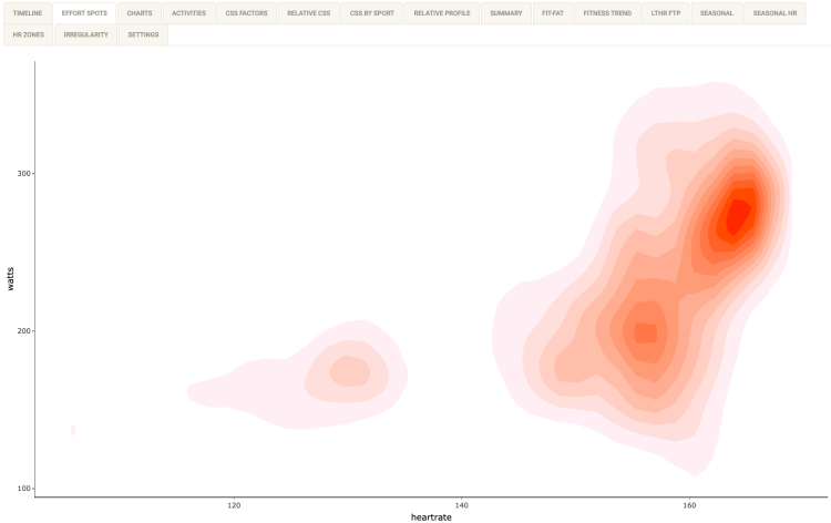
Effort Spots is a new feature in Crickles that is extremely useful for tracking fitness. This powerful tool can offer insights on real and virtual bike rides whenever a power meter and heart rate monitor have both been used. For such activities, the Effort Spots report gives a heat map showing the proportion of time spent at each heart rate and power level. Intuitively, this is what we most want to know from a fitness perspective yet, as far as I’m aware, it’s not available on any other platform.
The “spots” with deepest coloration are where most time is spent. In this example, this main spot is at around 165 bpm and 275W, with a secondary spot at around157 bpm and 200W and a third, off to the left, at around 130 bpm and 180W. Exact values on the plot can be explored by hovering to see (heart rate, power) coordinates – 165 bpm and 271W in this example:
It is particularly useful to compare Effort Spots for two different activities, especially when the same ride or turbo workout has been done at two different times. To see this, select a Reference Activity in the sidebar. A simplified plot in blue for the reference activity will be overlaid on the main plot:
In this example the main plot, in reds, has similar contours to the reference plot in blue but the spots are relatively leftwards in the main plot, indicating that more time was spent at lower heart rate levels, and higher, indicating that more time was spent at high power levels. We can conclude that the cyclist enjoyed a higher level of fitness at the time of the primary plot than at the time of the reference plot.
It is sometimes helpful to locate the effort spots with reference to training zones for heart rate and power. The checkbox in the sidebar enables you to see these:
With the box now checked, gridlines divide the plot into five heart rate zones based on an estimate of current Lactate Threshold Heart Rate (LTHR), and six power zones based on an estimate of current Functional Threshold Power (FTP). For example, the main/reddest spot is located in heart rate zone 5 (out of 5, counting from the left) and power zone 5 (out of 6, counting from the bottom). The zone lines can be used with a reference activity too: they always show zones based on current LTHR and FTP values, not zones at the time of the activity.
The screenshots above were based on a turbo session. Out on the road there is also (except on a fixie) freewheeling, and a corresponding amount of time spent at or near zero power:
In this example, the coloured areas rising from the x-axis where power is close to zero represent time spent coasting.
On some plots you will see shapes having straight edges and other non-natural patterns in the “cool” areas. These are not “wrong” but simply represent a limitation of the plotting method where the data is sparse. Similarly, in some areas of white space – say at 140 bpm in the first example above – there will have been some activity but just not as much as in the areas that are coloured.
Effort Spots are not currently available for activities that you marked as Private on Strava.