I have updated this post now. Previously I just attached the word file – time constraints. But today I have some time, so here goes. As far as I can tell, this is the most complete analysis of the data that exists to date.
A search using the term “Marathon” and “Death” or “Mortality” on Pubmed yielded 167 references (most recently performed 20/10/17). The abstracts of these were reviewed. The reference lists of the final articles included in this paper were scanned for further relevant literature and review articles were obtained and read and their reference lists reviewed. On-line web searches and direct approaches to authors were made to provide additional data.
The End-Note library can be found here. It does not include the texts of some of the papers which were behind pay-walls.
A total of 8 papers were included in the final analysis. The papers can be divided into two categories. The first category comprises a series of papers which looked broadly at hundreds of marathons run across the USA over the past 40 years. The second category comprises a number of papers that have focused on two marathons in the USA – The Marine Corps Marathon and the Twin Cities Marathon – and also the London Marathon.
I have not included results relevant to half marathons or ultra-marathons or other events, such as triathlons, except where indicated in the text. Furthermore, I have not included mortality from marathons run as part of an event, such as a triathlon.
American Marathons
There have been a number of efforts to collect data from a larger number of marathons that have been staged across America. It is probable that the data from these papers overlaps. Furthermore, it is more likely that deaths will be missed compared with the studies which have focused on specific marathons, and therefore these papers have the potential to underestimate the true fatality rate.
Redelmeier et al. 20071
Redelmeier and Greenwald published an analysis of 26 marathons and their related deaths, staged in the USA, which they followed for up to 30 years. The principal focus of the paper was to compare the number of marathon deaths with the expected number of motor vehicle fatalities to determine whether running a marathon was safer than not running one.
The authors screened the 328 American marathons listed in Runner’s World on 01/01/2005. They excluded those with less than 20 years of data, fewer than 1000 participants annually, or those that were located primarily on off-road trails or that were part of triathlons or other combined endurance events. They selected 26 marathons randomly from the remainder. Note that the Marine Corps data is included in this analysis.
Data on “sudden cardiac deaths” was obtained from local newspapers on the days after each marathon. Race directors were contacted.
A total of 3,292,268 participants were included in the analysis. There were 26 “sudden cardiac deaths”. 15 marathons had no death, 6 had one death, and 5 had more than one (Boston, New York, Chicago, Honolulu and the Marine Corps Marathon). New York had 2 deaths in 1994.
The average age of the fatalities was 41 years. 81% (21) of those who died were men. 5 deaths occurred in people who had completed a marathon before.
There were autopsy results on 24; 21 had coronary artery disease. Coronary anomalies were noted in 2. Electrolyte abnormalities were thought to be significant in 4 and heat stroke in 1. Most died within a mile of the finish line (Figures 1a and 1b).
The overall risk of a fatality, as estimated by this paper was 0.79/100,000 or 1 death for every 126,626 finishers.
Figure 1a. Location of Fatalities, Redelmeier et al. 2007
Figure 1b. Location of Fatalities, Redelmeier et al. 2007
Mathews et al. 20122
Using publically available racing (MarathonGuide.com, Athlinks, and The Association of Road Racing Statisticians) and news (Google, LexisNexis) databases and by directly contacting race organisers, the authors collected statistics on marathon finishers and deaths between 2000 and 2009. Data was cross-referenced with MarathonGuide.com.
The denominator – the numbers completing marathons during the 10-year period – was 3,718,336. There were 2,255,060 men who completed a marathon and 1,463,276 women.
They identified 28 people who died during the race or within 24 hours of finishing. 6 women and 22 men died. The male death rate was 0.98/100,000 and the female death rate was 0.41/100,000. The overall death rate was 0.75/100,000.
The median age of death was 41.5 years (IQR 25.5, range 22-68).
14 deaths occurred in people over the age of 45. 13 of those deaths were caused by atherosclerosis (Table 1). In younger racers, none of the deaths were caused by cardiovascular disease.
The median distance travelled before dying was 22.5 miles (IQR 10.6). 7 completed the marathon before dying. 18 deaths occurred after mile 20. Cardiac and cardiovascular aetiologies accounted for 24/28 deaths.
People were more likely to die in October marathons (n=11); 27% of marathon participants raced in October. This was of no consolation to myself when I ran the Dublin Marathon, in October, aged 47.
Table 1. Cause of Death, Mathews et al. 2012
Kim et al. 20123
In 2012, a study by Kim et al was published in the New England Journal of Medicine. They looked at cardiac arrests that occurred whilst running or within an hour of running a marathon or half marathon. I have not reported the ½ marathon data.
The database of cardiac arrests was compiled prospectively from Jan 1st 2000 to 31st May 2010 – a slightly different time period to Mathews et al. The arrests were cross referenced using LexisNexis and Google. Further searches were performed directed at particular race events and their local newspapers. Contact was also made with race officials. Cases of cardiac arrest were retained for the final analysis if they were identified in 3 separate data sources or confirmed with race staff. The next of kin of those who died were written to asking for further data about exercise history and family history and asking for consent to access medical data.
Running USA compiled statistics for participation (not finishers) rates in marathons or half-marathons in the USA. It was estimated that 3,949,000 people participated in a marathon, and 6,922,000 participated in a half marathon.
59 cardiac arrests were identified, 40 in marathons and 19 in half marathons. The incidence of cardiac arrest was 1.01/100,000 in marathons. 51 of the 59 people who arrested were male. 34 of the 40 arrests in marathons were in men. Male marathon participants had a rate of cardiac arrest of 1.41/100,000. The mean age of those who arrested was 42±13 years.
42 of the 59 died. The mean age of those who died was 39±9 years. The death rate was 0.63/100,000 during marathons (n=25) and 0.25/100,000 (n=17) during half-marathons. Overall men were more likely to die than women (0.62/100,000 vs. 0.14/100,000) during marathons and half-marathons.
Most arrests occurred in the latter quartile of the race (Figure 2). The data was not separated by race type or by mortality.
Hypertrophic cardiomyopathy was the most common underlying diagnosis overall. In those who survived, coronary disease was more common.
It was recognised that the method of ascertainment of cardiac arrests may have missed some cases, and therefore, the true rates of cardiac arrest and death may be higher. Complete clinical data was missing on approximately 50% of the cases. It was also recognised that the participants may have run multiple marathons, and therefore the total number of unique participants, would have been lower.
Figure 2. Location of Cardiac Arrests, Kim et al. 2012
Webner et al. 20124
In 2009 this group sent 33 item surveys to 400 race directors of US Marathons to ask about the number of marathon participants and associated deaths. 88 (22%) returned the surveys. The marathons were run between 1976 and 2009.
There were a total of 1,710,052 runners. Races had between 30 and 30,000 participants. 30 arrests and 10 deaths were reported. The risk of death was therefore 1 in 171,005, or 0.58/100,000. The cause of death was coronary artery disease in 7. One person had an anomalous coronary artery. The cause of death was not established in 2 cases. 28 of the 30 runners who arrested were male. The mean age of those who arrested was 49.7 years. The mean age and sex distribution of those who died was not specified in the paper.
The location of the arrests was again skewed towards the final miles of the marathon (Figure 3).
There were more participants in this paper, and one less death, than reported when the abstract was presented in abstract form in 2011. Discrepancies between abstracts and final papers are common as the peer review process often picks up errors.
Figure 3. Location of Cardiac Arrests, Webner et al. 2012
Summary
These papers can be brought together. It is clear that the typical person who arrests is a middle-aged male around 40 years old. The cause of death is often considered to be coronary artery disease. Typically, cardiac arrest and death occurs in the latter quartile of the race.
The risk of death estimated by these studies was approximately 0.70 per 100,000 finishers, that is 1 death per 142,000 participants (Table 2).
Table 2. Risk of Death During Marathons
Of the two studies that reported marathon deaths by sex, that is Redelmeier et al. and Mathews et al, there were 43 males (80%) who died and 11 females (20%). Mathews et al. reported the breakdown of participants by sex in addition. In that study there were 22 men who died and 6 women. The rate of male deaths was 0.98/100,000 (1 per 102,503) vs. 0.41/100,000 (1 per 243,879) in females (Table 3).
Table 3. Risk of Death by Sex
If further data was available from the papers, more accurate estimates could be made.
Specific Marathons
The Marine Corps Marathon and the Twin Cities Marathons
A number of papers have been published by the medical team associated with two marathons in the USA: The Marine Corps Marathon (MCM), held in Washington DC and the Twin Cities Marathon (TCM) in Minneapolis. Three papers have been published over the years, looking at data from these two marathons. All are freely available online.
Maron et al. 19965
This paper focused on the MCM from 1976-1994 and the TCM from 1982-1994. All deaths were included. The data is reproduced in table 4.
215,413 runners successfully completed the marathons during this time. 4 sudden deaths occurred during (n=3) or shortly after (15 minutes, n=1) completion of the marathon. 3 were male and 1 was female. The 3 men had coronary disease, the 1 woman an anomalous coronary artery. The one woman died in 1990 in the MCM, aged 19. One man died in the TCM in 1989, aged 40. Two men died in 1986 and 1993 in the MCM, aged 32 and 58 respectively.
Table 4. Maron et al. 1996
Roberts et al. 20006
This paper looked at the 81,277 entrants in the TCM from 1982 to 1994. It therefore contains no new information over and above that of Maron et al. 1996 with regards to deaths.
Its focus was describing all medical issues experienced by marathon runners. For interest medical encounter rates were 25.3/1,000.
Of note, it was stated that 60,757 finished the course – slightly different to the 60,379 from the 1996 paper. There were 48,330 male finishers and 12,427 females. There appears to be a further typographical error in the text, and this number is derived from the table reproduced below (Table 5).
Table 5. Roberts et al. 2000
Updating the data from 1996 yields the following (Table 6):
Table 6. Combination of Maron et al. 1996 and Roberts et al. 2000
Roberts et al. 20137
This paper used data from the two marathons between 1982 and 2009. 1982 was chosen, as data was reported by sex from that year onwards.
The paper reported that there were 540,892 finishers during the study period. 379,863 were male and 168,227 were female.
In total 14 runners collapsed suddenly. 7 were successfully resuscitated. There were 7 sudden cardiac deaths. There was still only 1 female fatality (age 19, anomalous coronary artery, 1990, MCM). The rest who died were male. The underlying diagnosis for all men was coronary artery disease. The mean age of the men was 48 years. The location of the collapse was on average at 16 miles.
The rate of death overall was 1/78,299 finishers or 1.28/100,000. In men the rate was 1/63,311 finishers (1.58/100,000) whereas in women it was lower at 1/68,227 (0.59/100,000).
Details of the deaths are as follows (Table 7).
Table 7. Details of Deaths. Roberts et al. 2013
Further Data
The Marine Corps Marathon have now published data on their website of the number of finishers since the race began in 1976. It can be found here, and is reproduced in table 8.
Table 8. Marine Corps Marathon Finishers
This allows for a combination of all of the papers, leading to a final estimate of risk:
Between 1982 and 2009 there were 540,892 finishers. From 1976 to 1981 a further 26,387 completed the MCM. The total finishers of the two races from their inception (MCM 1976, TCM 1982) to 2009 was therefore 567,279. There were 7 deaths in that time. The rate of death, therefore, was 1.23/100,000 finishers, or 1 death for every 81,039 finishers.
The London Marathon
Dan Tunstall-Pedoe was the London Marathon Medical Director between 1981 and 2006. He presented data on the first 26 London Marathons in 2007.7
In the paper, data was obtained from St John’s ambulance, receiving hospitals and the coroner. The paper stated that there were a total of 650,000 finishers. A total of 8 deaths were recorded in this time.
The first death was in 1990, and ascribed to hypertrophic cardiomyopathy (HCM). In 2001 and 2005 there were two further deaths from HCM. Deaths in 1993, 1995, 1996, 1997 and 2003 were ascribed to ischaemic heart disease.
This yielded a crude rate of death of 1/81,250 (1.23/100,000).
There is also corroborative data online, written by him and published at Peak Performance with data up to and including 2003. The data there is slightly different. HCM deaths were reported as occurring in 1990 and 2001 – as above. 5 deaths from ischaemic heart disease were reported as occurring in 1991, 1994, 1995, 1997 and 2003. This was the same number of deaths as in the published paper over the same timeframe. Data was published on the number of finishers up until 2003. This yielded a death rate of 1/67,414 (1.48/100,000).
An online search to determine the number of finishers yielded data from additional sites. There are race reports, hosted on the London Marathon website, which mention the number of finishers in the very early races. Wikipedia provides data on the first London Marathon. Marathonguide.com has data on the number of London Marathon finishers. I also searched the London Evening Standard and BBC News Websites. Combining the data from these sources yields the following table (Table 9). All the data is from marathonguide.com unless otherwise specified.
I also emailed Professor Sanjay Sharma, the current director of the London Marathon, who was kind enough to respond directly. He stated that there have been 14 deaths.
As of 2017 over 1,000,000 people had completed the London Marathon (1,038,733). This yields a death rate of 1/74,105 or 1.35/100,000. I look forward to seeing a more detailed paper from Professor Sharma with confirmed finishing statistics and further medical details, including the age and sex, of those who died.
Table 9 summarises the data as far as is possible.
Table 9. London Marathon Data
1 Wikipedia.
2 Virgin London Marathon Website.
3 Peak Performance Data.
4 Tunstall-Pedoe D. Marathon Cardiac Deaths. Sports Med 2007;37:448-50.
HCM Death from hypertrophic cardiomyopathy
IHD Death from ischaemic heart disease
Summary
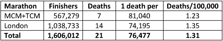
These two sets of data can be drawn together, yielding a death rate of 1/76,477 finishers or 1.31 deaths/100,000 finishers. The two separate marathons have strikingly similar results (Table 10). The rates of death are higher than those ascertained by more general surveys, as would be predicted as the authors were directly linked with providing medical support to the marathons over many years.
Table 10. Mortality During Specific Marathons
General Conclusions
Men around the age of 40 are the most likely to die participating in a marathon. Death typically occurs in the latter stages of the marathon, and is often caused by previously undiagnosed ischaemic heart disease, although hypertrophic cardiomyopathy and increasingly heat stroke are also concerns.
Different methodologies have yielded conflicting estimates of the death rates during marathons. Large surveys of multiple marathons have suggested that the death rate is 0.70/100,000 finishers. Detailed studies of a small number of events has suggested the rate is higher at 1.31/100,000 finishers.
As always, the truth is somewhere in between. But what is clear is that the chances of dying during a marathon are very low.
The data are frustrating. The authors of the papers almost certainly have some further data, not included in the publications that could facilitate a more formal meta-analysis.
What is needed, however, is a prospective registry of entrants / finishers and medical events from race directors. It would help understand what the true extent of the problems are. It would help concentrate medical expertise and help train event professionals to deal with the most common scenarios.
How to screen for these problems in advance? An ECG can be helpful and is often advised, but does not reliably pick up either ischaemic heart disease or hypertrophic cardiomyopathy. An echocardiogram can diagnose hypertrophic cardiomyopathy reliably. A cardiac CT can pick up asymptomatic coronary disease. Judging from the lack of symptoms and training, an exercise tolerance test or stress-echocardiogram is likely to be falsely reassuring. But that is a lot of testing to prevent a rare event. It’s not cost effective, and can probably not be supported by the NHS in the UK, at least.


