
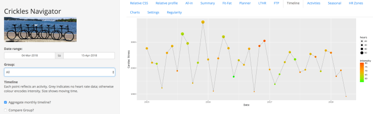
The Timeline in the Crickles Navigator shows your Cardiac Stress for each activity in the selected Date range. There is now a new feature that enables you to see your aggregate Cardiac Stress month by month. To select this visualisation, when you’re on the Timeline tab check the Aggregate monthly timeline? checkbox in the side panel. Then you’ll see a chart like this:
Each point on the chart now represents a whole month rather than a single activity. Also, the x-axis here doesn’t depend on the Date range but reflects the full extent of your history loaded into Crickles. The first point of every year – the one that sits exactly on the vertical year line (e.g. the first point in the figure, which lies on the 2015 line) corresponds to January and the last point, which sits before the start of the next year, shows the December value.
The points are still coloured by Cardiac Intensity and sized by Hours of moving time, as on the normal Timeline. However, since aggregating by month tends to even out differences, the size scaling is emphasised on the Monthly display.
This new chart gives you the ability to identify your easier and harder months, and to see at a glance how the Cardiac Stress accrued in a particular month arose from duration versus intensity of exercise. For example, in the figure you can see that after a month of very low Cardiac Stress in October 2016, the two months following saw a return to higher levels, generated by greater intensity – this was due to the increased difficulty of achieving previously normal performance after a period of de-training.
Obviously the last point on the chart will normally reflect the current month so Hours (indicated by size) and also the level of Cardiac Stress will tend to be lower than normal until the month comes to an end. There is no correction for shorter/longer months.
To compare your results with others, use the Compare Groups? checkbox. This brings the Group dropdown into play, giving you the ability to compare your monthly Cardiac Stress to all other Crickles athletes, or to sub-select based on your gender or age:

The larger the group you compare to the more Intensity will tend towards mid orange and the less variability there will be in Hours. You will also notice a seasonal trend with a high in Summer and a low in Winter (so long as the Crickles cohort remains heavily weighted towards the northern hemisphere!).