Joining Crickles

The Crickles community is essentially defined by the athletes who can see analysis of their activities on the Crickles Navigator. The sign-up process is relatively simple, although a little less simple than it used to be before Strava stopped making user email addresses available to Strava Apps. Here’s what you need to do:

Step 1

Go to http://signup.crickles.org and authorise Crickles to access your Strava data.

This is the same as hitting the orange “Connect with Strava” button on this website. You need to do one or the other but there’s no need to do both.

Step 2

Wait 24 hours.

In the past we could email you a notification of when your activities have been downloaded together with a reminder of your Strava ID. This is no longer possible.

Step 3

Go to the  Crickles Navigator, which you can access either through the menu bar on this page or through this link.

You’ll be asked this first time to supply your email address and Date of Birth and to request a password. A password will be then generated and emailed to you; this should only take a few seconds.

Step 4

Log into the navigator (same link as above) using the new password.

If you wish you can change this to a password of your choosing using the Change password? checkbox in the sidebar.

Step 5

Please take our very short survey here.

That’s it! Email me if you have any problems at ian@crickles.org.

Enhanced FTP charts

For cyclists who use a power meter, the FTP chart on the Navigator now explicitly states your estimated Functional Threshold Power (FTP) at the start and end of the chosen Date Range. By default, the end of the Date Range, and hence the date of the second FTP level shown, is today. This enables you to see at a glance your current FTP and how it has changed over the period. You can also reset the Date Range to see your FTP at the start and end of different periods.

We are occasionally asked about differences between the FTP estimates on Crickles and on Strava or other sites. Usually they’re all close but occasionally estimates can differ materially. There are two known reasons for this:

  1. Short protocol FTP tests – for example, some sites form an FTP estimate from an 8 minute burst. In contrast, Crickles infers FTP from efforts lasting 20 minutes or more since the definition of FTP is the power level that can be sustained indefinitely (or for an hour, depending upon what you read). Strava appears to give more precedence than Crickles to short duration power and you can see a difference in FTP estimates if you’re going full gas over that kind of timeframe.
  2. There can also be temporary differences in the time it takes for different sites to reflect an outstanding performance or set of performances in their FTP estimates. The Crickles FTP estimate shown on the chart incorporates information from all rides except the latest one.

Crickles (and privacy) in 2019

It’s been a little while since the last noticeable change to the Crickles Navigator. From the feedback we get it seems that people find the Fitness and Fatigue functions to be particularly useful, and truer to actual feelings of fitness and fatigue than the alternatives available elsewhere. This supports our belief that the Cardiac Stress Score (CSS) is a decent functional measure of the cardiac stress incurred during exercise.

There are a number of changes that I’d like to make in 2019. First, I plan to update the analysis of data from the Crickles survey. Last time I checked there were suggestive relationships between reported cardiac health and CSS-based measures on Crickles. Now that we have materially more responses, I’m curious to see whether these relationships attain a level of robust statistical significance.

As well as new features such as user-configured alerts, I’d also like to strengthen the Crickles technical platform. This requires a little more investment. To fund it, I’ve explored a number of collaborations with other health and fitness products to see whether the Crickles analytics could add value to them and generate enough income for our own improvements. In every virtually case I have so far found that these other products do not respect user data in anything like the way that Mark and I require and so collaboration is impossible.

One consequence of what seems to me to be widescale abuse of user data is that Strava themselves, whether on principle or in the light of the EU’s General Data Protection Regulation, have tightened up app access to Strava data. Last year they removed the ability for an app to identify a user’s Strava followers/friends. This meant that thereafter Crickles was unable to offer group selection based on your current Strava friends. This is sad but we can’t blame Strava: other apps were, to my knowledge, chaining through users through their follower relationships to trawl data without appropriate consents. At the start of this year, Strava removed the ability for apps to access users’ email addresses. This makes the Crickles sign-up process more difficult, but, again, Strava really had to do that to avoid inappropriate data harvesting by unscrupulous apps. (It also meant more work for me that I didn’t want to do!)

This is all frustrating but it’s the reality of the current social network landscape. Most applications base their business on non-transparent forms of “social listening”: offering functionality as a lure to gain personal user data that can be re-sold to advertisers. Crickles will never do this. What we may instead do is offer a premium tier and levy a modest charge for it. I have mixed feelings about this but it would help me cover my costs and fund the improvements to Crickles that we’d like to make. A premium service may include, for example, analysis of more/all of your activity history; email and/or text alerts; personalised reports; and new/advanced analytics.

Meanwhile, we’ll continue to support Crickles as it is now and occasionally add new features, as we have been doing. Also, I’ll report back on the findings from the survey when they’re in.

Anastasiia is not one of us

Some of you may have noticed this, or something like it, in your Strava feed:

Screenshot 2018-10-30 at 16.06.04

I had a similar “discussion” in my Strava feed from another club – Regents Park Cyclists – a few days ago. The more revealing photo in that instance apparently depicted someone called “Brian”.  It goes without saying that we must assume that these come from hackers and/or pimps, and that the photo is no more likely to bear a true likeness to the git who posted it than the message is to reflect an honest yearning for a connection of human warmth.

As far as I can see, there’s nothing to stop anyone from joining any club on Strava and “starting a discussion”: the only remedy is to make clubs invitation only, which would be a shame. If we get more Anastasiia’s, that’s what I’ll do. For now, I’ve booted “her” sorry ass out of the club, even though it’s a futile gesture.

The serious issues behind this, beyond the huge ones of cyber/identity theft/fraud and human trafficking, do impact us directly in smaller ways. At the end of this year apps like Crickles will no longer be able to obtain the email addresses of their members from Strava – presumably because the abuse of this facility is already a problem. This is certainly an inconvenience.

I’ll write more about this, and about data policy on Crickles, in due course.

For now, be aware that the Strava Crickles club has no meaningful relationship to Crickles as you know it from this website and the Navigator. It’s simply a bulletin board with, as it happens, quite a different membership from “true” Crickles. Your data as seen on the Navigator is held securely on the Amazon Cloud (like Strava’s data) and the appearance of Anastasiia in your feed does not imply that it has been hacked.

Major update to Fit-Fat charts

Fit-Fat charts on the Navigator have had a subtle but important upgrade. Initially, the tab looks unchanged:

ff_3_charts

The main difference at first is that by default all of your Crickles history now appears.

There is also a new drop-down in the side panel that enables you to chart just one of the fit-fat lines:

ff_dropdown

For example, if you choose Fatigue as here you’ll see this:

ff_fatigue

This makes it easier to see changes in each of the three charts.

Furthermore, if you hover over any of the charts you can see the Stress Load (i.e. the CSS) alongside the numerical value of the Fitness, Fatigue or Form on each day. Moreover, you can also draw a rectangle around any part of the charts to zoom in on that time slice – that’s why the Date Range on the side panel is no longer relevant for Fit-Fat. Here’s an example of a zoom in on the above chart to see the time around the end of 2016/start of 2017 in more detail:

ff_zoom

To unset the zoom just double click on the chart.

Why statistics makes you feel old

Yesterday I was cycling up one of the local hills that is often on my route home when I realised that it’s increasingly unlikely that I’ll ever beat my personal record (PB) for the climb. Of course, I’m getting older and presumably less strong and that in itself makes it less likely, but what struck me was that even without a decline in athletic capability the chances of setting a new PB decrease after a certain time. Let me explain…

Imagine that you do the same event most weeks – say a park run or a TT circuit – over a number of years. Further, let’s suppose that your “true average time” for this is, say, 25 minutes but that your actual time on any particular week is affected by a number of varying factors. These could be, for example, the wind and weather, the volume of traffic you encounter, how well you slept, the state of your kit (bike, wheels, shoes…) and so forth. Perhaps we can summarise these into three separate variables for (1) environment (wind direction, traffic…), (2) personal condition (restedness, current form…) and (3) state of equipment (which bike and wheels you used…). It doesn’t matter what the variables actually are so long as we suppose, for the purpose of this thought experiment, that they are normal, trend-less and independent. Then, we can add all the random factors together into a single “net random factor” and this will also be normal.

Now in reality you may immediately object that in real life the “personal condition” variable is not trend-less because we initially get fitter as we start a new form of exercise and then over time we age and get less fit. However, my key point is that it will feel like this even if it’s not the case! To see this, let’s suppose that our fitness/form varies from week to week according to a variety of factors but, on average, doesn’t change over time.

Given these assumptions, our weekly time will always be 25 minutes plus or minus a varying amount. In the first few weeks it’s in the nature of statistical fluctuation that we will probably quite often set a PB. However, as time passes we’ll have those occasional “magic days” when the wind and air pressure are favourable, we have only green lights, we’re on our fast bike or in new shoes, and we’re rested and well trained. When all of those factors align we’ll set an exceptional time. In terms of our model, the net random factor will be at a rare and favourable extreme value. Because such values are rare, the time between PB’s will increase.

To illustrate this, I modelled it for an athlete who begins doing the regular weekly exercise at age 20 and continues each week for 50 years. This chart shows five sample random paths, which we can think of as corresponding to five athletes all starting at age 20 and performing the same weekly exercise until age 70:

net_random_value

As you can see, in each of the five cases, before the age of 50 (30 years on from the start at age 20) the athlete has attained a PB that isn’t seen again before age 70. For example, the red line represents an athlete who sets a couple of PB’s within the first five years, then a new one at around age 40 that isn’t matched again in the remaining 30 years. The green athlete has the most encouraging career and the orange athlete the least, while the violet athlete manages the latest PB at age 49.

Over 1,000 such random paths the average age of the last PB is 45, halfway through the athlete’s career. Remember, this is just an artefact of statistical randomness and happens even on the assumption of constant athletic ability!

The psychological impact of this is obvious. Most of us judge our “true” capability to be that recorded by our best times. As those PB’s recede into the past, even if our average times stay the same, there is a perhaps a tendency that it will induce a feeling of nostalgia and a worry of ageing. In truth, a new PB could (in this fantasy world of constant physiology) occur just as easily tomorrow as it did 20 years ago. The problem with ageing, viewed statistically and irrespective of physiology, is that we may not have enough tomorrows left in which to replicate the most extreme favourable conditions of our plentiful yesterdays.

Heart Rate Regularity

Mark and I quite often get asked about suspicious heart rate readings by people using Crickles. Often these are probably just Garmin/strap errors: the majority of our population occasionally see heart rate values that look wrong…

max_hr_density

The chart shows the distribution of maximum recorded heart rate by athlete. 62% of athletes show a maximum HR over 200 bpm, for 36% it’s over 220 bpm and the maximum to date stands at 365 bpm. These values are dubious. Data cleaning is therefore an important part of Crickles algorithms.

While it is not an aim of Crickles to train algorithms to give a medical diagnosis of heart problems, we do flag when activity data looks unreliable for use in quantifying the cardiac stress score (CSS). The Activities page on the Navigator now shows a new column called Diagnostic. This is only populated for activities where a heart rate monitor was used – if not, it appears blank. (It may also very occasionally appear blank for other reasons.) Where a Diagnostic value appears it will be one of the following:

  1. Check_Strap – it looks probable that there was a recording error and the heart rate data for this activity is wrong;
  2. Irregular – the heart rate data stream looks questionable but Crickles cannot reliably ascribe this to a strap error;
  3. Regular – the heart rate data is good for use in the measurement of CSS.

This algorithm that produces this diagnostic does about as good a job as I can do by eye at identifying odd-looking data streams, and (unlike me) it can do this consistently on the hundreds of thousands of activity records in Crickles. However, it is not in any sense a medical diagnosis and the appearance of only Regular values is no guarantee of good health.

When Crickles athletes email us with concerns about their cardiac health I do sometimes opine on how relatively un/usual the data may look but the medical aspects of such questions are always addressed by Mark, who is a cardiologist. Mark can look at the data in the context of symptoms, such as chest pain or fainting, and the athlete’s medical history.

To explore any Check_Strap or Irregular activities you may have, on the Activities tab you can:

  • Change the Date Range in the side panel to select the time horizon you want to explore;
  • Use the Search box on the top right of the screen to pick out Check_Strap or Irregular values;
  • Use the small triangle next to Diagnostic to sort your activities by Diagnostic.

The Regularity page has had a make-over to show the frequency with which Irregular values occur. Previously only available as a beta feature by request, this page now has two charts. The one on the right is the chart that was present previously:

hra_ian

This shows whether your recent aggregate heart rate pattern is different from its historical pattern. Significant changes such as that shown can be due to an intentional change in your exercise regime – for example, reducing the intensity of exercise. If the gloss at the top indicates a significant change with sufficient data for a valid comparison (as here) but you haven’t knowingly modified your exercise habits it may be worth digging in further.

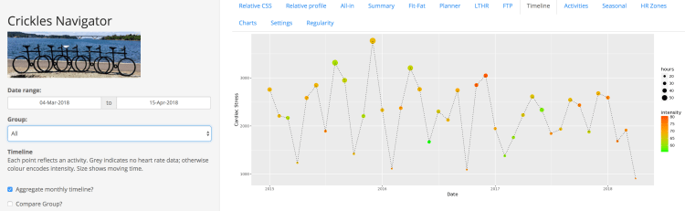
This chart responds to the three checkboxes in the side panel, as before.

The left-hand chart on the Regularity tab is new:

irreg_ian

This shows quarter-by-quarter how often you’re getting Irregular as the Diagnostic for your activities on Crickles. As with CSS, there is no firm science on what constitutes a good value but what we can do is show how you compare to the (Crickles) crowd. Values above the two orange lines, and especially the solid orange line, are unusually high.

The size of each quarterly point indicates how many activities contributed to it. A high Irregularity Ratio is less meaningful when it is derived from only a few points. As a guide, 30 points can be taken to constitute a good sample. The gloss above the chart tells you exactly how many Irregular diagnostics you’ve had in the current quarter, and, for good measure, the number of Check_Strap diagnostics (which is not shown on the chart).

If you consistently see an Irregularity Ratio above the orange lines based on a meaningful number of activities, it’s worth changing your heart rate strap. If you continue to see a high ratio, we’d be interested in hearing from you.

While Irregularity Ratio is a useful measure for data verification, there is no science that establishes an association with cardiac health. Intriguingly, a number of our active athletes have filled in the Crickles survey and, amongst these, the average Irregularity Ratio happens to be 56% higher in athletes who report a diagnosis of Atrial Fibrillation than amongst those who don’t. However, to attain significance in a statistical test – or to find that it’s a coincidence – we’d need many more people to fill in the survey. If you haven’t done so yet, please do so here. The survey is super-quick to complete and all responses are equally useful, even if you have only good health to report.

Enhancement to the Timeline tab

There is now a new feature on the Timeline tab that enables you to see the name of the activity corresponding a point on the chart. When you look at the Timeline you’ll see a new “Click on a point to see the activity name” annotation in the top left:

Timeline activity

If you single click on the centre of one of the points on the chart that annotation will instead show the activity name. You have to be quick as the name will disappear after a moment – if you didn’t catch the name you’ll have to click again!

If you never name your activities on Strava then the names you see here will be generic – “Morning Ride”, for example. The feature is only really useful if you’re in the habit of giving your significant activities meaningful names.

This feature does not, of course, work on the aggregated monthly view of the Timeline.

Enhancement to Relative CSS

When you now look at the Navigator you’ll see that the colour scheme on the Relative CSS tab (where you normally first land) has changed: the bars other than the one representing you are pink rather than blue. This reflects a change in the default methodology to include all activities and not just those for which heart rate information is available. In the absence of data from a heart rate monitor, Crickles estimates cardiac stress from a power meter if one has been used (this is a good estimate), and in the absence of both heart rate and power data Crickles falls back on an estimate based on observed averages (this a poorer estimate, but better than ignoring those activities altogether).

CSS pink

If you want to go back to the old style, giving you analysis based only on activities with heart rate data, just tick the new Require heart rate data? checkbox in the side panel. This will revert to the previous methodology and the bars depicting other athletes will once again be blue.

HR checkbox

If you use a heart rate strap less than the general Crickles population, the new (pink) methodology will tend to move you further to the right of the distribution. Conversely, if you use a heart rate monitor most of the time you’ll tend to move to the left as the activities of non-monitor wearers are added in.

You can see the numerical impact of the change by looking at your change in Cardiac Stress value on the y-axis.

This does not affect any tabs other than Relative CSS.

Aggregate Monthly Timeline

The Timeline in the Crickles Navigator shows your Cardiac Stress for each activity in the selected Date range. There is now a new feature that enables you to see your aggregate Cardiac Stress month by month. To select this visualisation, when you’re on the Timeline tab check the Aggregate monthly timeline? checkbox in the side panel. Then you’ll see a chart like this:

Monthly_Timeline

Each point on the chart now represents a whole month rather than a single activity. Also, the x-axis here doesn’t depend on the Date range but reflects the full extent of your history loaded into Crickles. The first point of every year – the one that sits exactly on the vertical year line (e.g. the first point in the figure, which lies on the 2015 line) corresponds to January and the last point, which sits before the start of the next year, shows the December value.

The points are still coloured by Cardiac Intensity and sized by Hours of moving time, as on the normal Timeline. However, since aggregating by month tends to even out differences, the size scaling is emphasised on the Monthly display.

This new chart gives you the ability to identify your easier and harder months, and to see at a glance how the Cardiac Stress accrued in a particular month arose from duration   versus intensity of exercise. For example, in the figure you can see that after a month of very low Cardiac Stress in October 2016, the two months following saw a return to higher levels, generated by greater intensity – this was due to the increased difficulty of achieving previously normal performance after a period of de-training.

Obviously the last point on the chart will normally reflect the current month so Hours (indicated by size) and also the level of Cardiac Stress will tend to be lower than normal until the month comes to an end. There is no correction for shorter/longer months.

To compare your results with others, use the Compare Groups? checkbox. This brings the Group dropdown into play, giving you the ability to compare your monthly Cardiac Stress to all other Crickles athletes, or to sub-select based on your gender or age:

Monthly_t_group

The larger the group you compare to the more Intensity will tend towards mid orange and the less variability there will be in Hours. You will also notice a seasonal trend with a high in Summer and a low in Winter (so long as the Crickles cohort remains heavily weighted towards the northern hemisphere!).